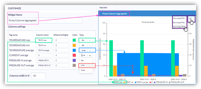
Columns Widget – Customization
You can customize your widgets to effectively display your data, according to your dashboard requirements.
You can enter
a Widget Name—a display name for the title bar and customize
the appearance of your widget, including Columns, Axes, Tooltips, Legend, and
more.
Note that:
· As you work, the Preview shows your changes.
· You can click the ‘hamburger’ icon on the upper right of the Preview to download the Preview as a graphic, or the values as a .csv file.
Columns settings
· Column name: the default name is the Tag name; type in a Column name as an alias to display in the widget.
· Decimal digits: enter the number of decimal places you want to display
· Colors: click a color box and use the Color Picker to assign specific colors.
· Type: click the drop-down to express a column value as a Bar, Area, or Line.
· Columns width: enter the desired width, expressed as a percentage
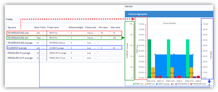
Y-Axis
· Show Y-Axis: click the
drop-down arrow and select Left or Right to show this tag as a Y-Axis value.
In the next image, TEMPERATURE max and CURRENT average have both
been selected as Y-Axes on the left, and TEMPERATURE min selected as an
axis on the right.
· Y-Axes name: the default name is the Tag name; type in text as an alias to display in the widget.
· Decimal digits: enter the number of decimal places you want to display
· Y-axes Scale: click the drop-down arrow and select Manual to set the desired values. In the next image, you can see different values assigned to each axis.
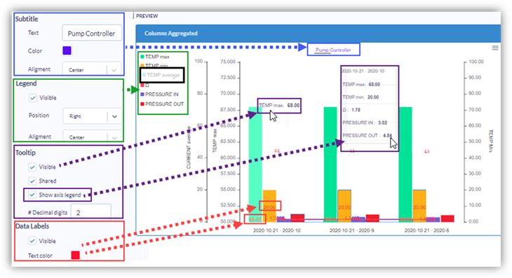
Subtitle, Legend, Tooltip, Data Labels
· Subtitle: you can enter text and determine its position and color.
· Legend: you can determine
its position and color.
Note that in Preview, you can click an item in the Legend to hide the column;
in the following image, TEMP average is hidden.
· Tooltip: select Visible to
show a tooltip when you move your cursor over the widget; you can also set a
decimal place.
To show all of the items listed in the legend, select Show Axis Legend.
· Data Labels: select Visible and set a color to display the value of each column on the column itself.
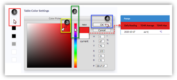
Colors
The color picker works on the same principles for all Dashboard elements.
1. Click a color square to open the Color
Picker.
2. Select the Color in the selection bar.
3. Click the color field, and drag your cursor to the desired color.
4. Click OK; the element will take on the
color of your selection.
The following image shows a shade of red being applied to a table row background.
Click Next to continue.
Related Topics
· Columns widget – display Asset’s last
data
· Columns widget – display Asset’s
aggregated data